
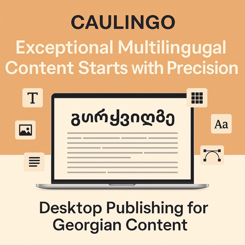
Exceptional multilingual content starts with precision: combining expert translation with careful visual presentation. Desktop Publishing (DTP) is the cornerstone of delivering polished, culturally aligned materials, especially when working with the Georgian language’s unique script and typography requirements.
Our Georgian DTP services can support consistent presentation across translated and localized materials.
Why Georgian DTP Demands Specialized Expertise
The Georgian language, with its Mkhedruli script, presents unique challenges for multilingual DTP, as highlighted by W3C’s Georgian Gap Analysis and Typotheque’s typography insights. These challenges are critical to address for businesses expanding into new markets:
- Unique Script: Mkhedruli lacks traditional uppercase/lowercase distinctions. Instead, Mtavruli is used for titles or emphasis, which impacts layout design and brand consistency.
- Text Expansion: Georgian text can occupy a different amount of space than English depending on wording, font, size, and layout, so DTP should allow for flexible text expansion and contraction.
- Italic Treatment: Italic treatment is less conventional in many Georgian typefaces and designs, so emphasis should be chosen according to the font, brand system, readability, and publishing context.
- Font Compatibility: Non-Unicode fonts cause rendering problems across platforms, leading to broken characters and inconsistent branding.
These characteristics make specialized DTP expertise essential to ensure readability, cultural alignment, and a professional appearance in Georgian-language content.
Key DTP Guidelines for Georgian Localization Success
These recommendations can help support clear, consistent Georgian typography in localization projects:
- Select Unicode-Compatible Fonts: Use fonts like Noto Serif Georgian, Sylfaen, or BPG Nino Mtavruli Bold. Avoid outdated fonts such as AcadNusx.
- Avoid Italics: Use bold or Mtavruli for emphasis—italics look unnatural in Georgian.
- Mtavruli and Mkhedruli: Mtavruli can be effective for headings or display text, while Mkhedruli is widely used for running text. The appropriate choice depends on the typeface, design system, audience, and publishing context.
- Allow Flexible Text Space: Translated text can occupy more or less space than the source depending on language, wording, font, and layout.
- Ensure Robust Encoding: Always embed Unicode-encoded fonts in tools like Adobe InDesign and test rendering across devices.
- Maintain Consistent Formatting: Apply Georgian conventions such as day.month.year (15.01.2025), commas for decimals (0,50), and standardized terms like „გაფრთხილება“ (Caution) for alerts.
Why Georgian DTP Matters for Your Brand
Poor DTP execution can derail even the best translation and localization efforts:
- Brand Reputation: Incorrect typography or broken characters signal unprofessionalism.
- User Experience: Poor spacing or unnatural word breaks reduce readability and engagement.
- Consistency: Non-standard fonts and formatting create inconsistencies across platforms.
- Cost Efficiency: Correcting mistakes later increases costs—getting it right the first time saves time and budget.
Consistent, culturally appropriate design can support trust, readability, and a professional user experience.
Applying the guidance in production
A careful DTP workflow combines linguistic review and production expertise so content is accurate, visually coherent and ready for publication. Key work can include:
- Georgian DTP Services – Custom layouts for brochures, manuals, and software interfaces.
- Professional Translation & Localization – Accurate, culturally adapted translations for Georgian and beyond.
- UI/UX Adaptation – Seamless integration of localized text into digital platforms for optimal usability.
- Multilingual SEO – Keyword optimization to maximize visibility in global search engines.
AI tools can support efficiency in some tasks, while human linguistic and production review helps maintain consistent, visually coherent localized materials.